Community Manager Jaime Lawrence chats to Joel Finch about the way art comes together in Unfair...
One of the best parts of the whole Unfair experience is its art and graphic design. It’s functional yet immersive, vibrant, colourful and often has its tongue very firmly stuck in its cheek. But just as game design is an evolving process, ideas about how the art and graphic design work together grow and change as it is being worked on by all the parties involved in its production. To find out more about the way that Unfair came to life visually, I had a conversation with the game’s designer, art director and graphic designer, Joel Finch.
Joel is a graphic designer, and establishing the usability of the game was explored and iterated continuously throughout Unfair's development, framing all the art that would eventually be added. “The original playtest cards were just a bunch of circles with numbers in them, backed with cards from old trading card games. I’m not even sure what they were meant to be anymore”. Joel showed me a document which has each iteration of a card (the ‘Dragon Coaster’, destined to eventually become ‘Blackbeard’s Revenge’), each with notes about what changes were made and what inspired them.
“The Dragon Coaster was the first card I did as a trial (pen sketch and all), but it didn't stick around. After the third iteration, it became the Shadow Dragon, Ninja Supercoaster, but when we got to the art, I picked Blackbeard's Revenge as the one to complete for the trial, so that was the one I went back and picked out all the old versions of. The transition between the last Dragon Coaster and the first Blackbeard's Revenge changed a few things at once, and I wanted to talk about the theme icon/colour change, so I used Davy Jones Locker as a bridging card.”
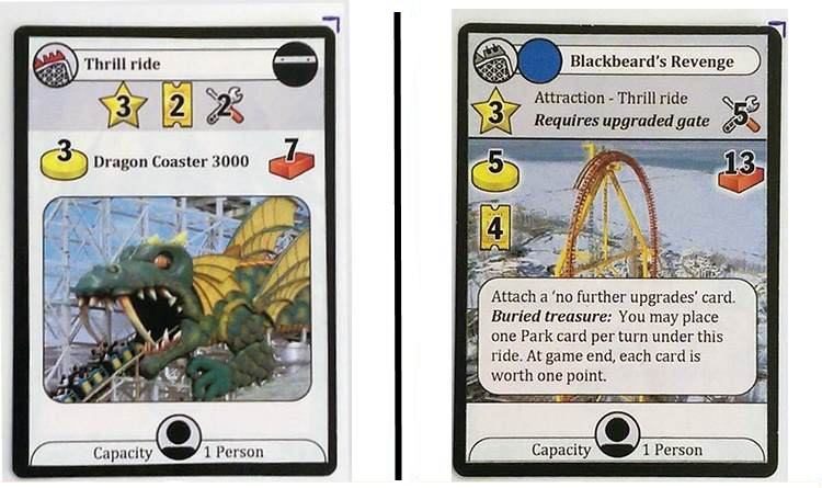
From Big Mouth to Big Dipper - the first major changes to the layout added more functionality to cards
The first really familiar version that catches my eye has its information sorted so that when other cards were stacked on it, the important aspects would remain visible, a mechanic that carried through to the final design. More striking is the change from the Dragon Coaster’s close up placeholder photo to a long shot of a very big dipper.
“From my previous work on computer games, I knew not to spend money on art until the gameplay was finalised, so to make the cards easy to recognise during testing, we used stock photos”. As we first assessed Unfair for publishing, even the stock photo cards gave the game a sense of immersion - you can visualise what you’re building. The grand vision for the game's immersion - function blend was layed down.
One of the cards has some scribbled marks in sharpie on it. “Maintanence, buy costs and points on the card, what was I thinking?” - Joel may lament the early design, but there’s something cool about the history of it - it’s like looking at an artifact from an ancient civilisation. I enjoy seeing how things have changed. I notice the first card with a lettered theme icon on it and Joel tells me about the icon’s origin.
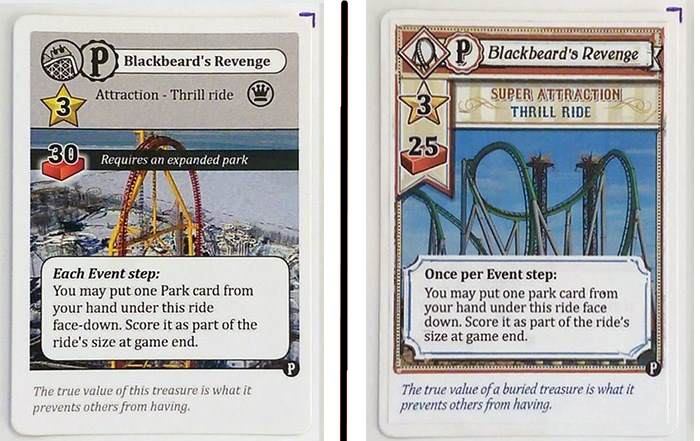
Familiar colours, shapes and lines begin to appear as the cards evolve into the modern layout for Unfair.
“Colours wouldn’t cut it for identifying themes, since we’d just decided there would be many more than the original plan of five. We wanted to makes sure they were distinct for everyone, including those with colour vision deficiency - 8% of males and 0.5% of females in the world.” Graphic design has to consider a number of elements beyond the eye of the beholder and it’s clear that Joel has done his homework.
Further along the chart, there’s a card with a now familiar red frame. There’s a note here that says “R.I.P. Grey Everything”, but ironically, compared to the final art it looks very washed out. Soon after that, familiar symbols start to appear - gold coins for the cost, inside a neat price tag. A lot of moving around of symbols, rearranging, additions of banners and stripes of colour. Things reallt taking shape. Then comes the first card with artwork, rather than a photo. Everything changed.
Subsequent iterations would make the work bigger and more vibrant, but this was a revelation. I asked Joel about how he made the jump from ‘loops of metal’ to the Blackbeard’s Revenge as we know it. He showed me the brief he sent to Mr. Cuddington:
Super attraction - Thrill ride - Blackbeard's Revenge.
Location: on the ground, outside the ride, near-to-mid distance from it, looking a bit upward to indicate height
Action: the roller-coaster car is going past with a full load of passengers
Description: The Pirate theme upgrade is built in to this ride, so it should be overtly piratey. The card gives the ability to bury things, and to score a tall ride, so elements such as a treasure chest and ship's masts are relevant. People are visible, but none close up, more like architectural figures to show the scene is occupied. Only a portion of the track is needed, not the whole ride, and since this is the main attraction itself rather than an upgrade, it should also include some part of the entrance so that it's grounded.
Mood: Adventurous
There are also notes about the first draft, a few tips and changes. It’s kind of shocking to me that the version of the game I saw when I started playtesting was the 20th iteration. Unusually as publishers, we were immediately impressed with the way the graphic design and early art blended into a these beautiful yet functional cards. We helped with a few more changes before we reached the final card layouts:
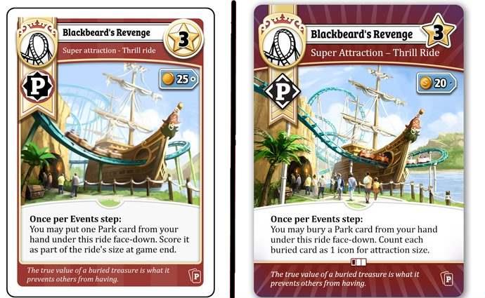
The final changes to the appearace occurred with guidance from GGP to make it both more functional and aesthetically pleasing.
Looking at that final image, I asked Joel what part of the process was the most satisfying. “I like it when the art hits its mark - its role is to help the player imagine what they're doing in the game, beyond just shuffling bits of cardboard, and when it gets across those ideas clearly, that means that I've done my job right. The easter eggs are fun, and I certainly enjoy tucking little things in here and there, but if the artwork wasn't good quality and a good fit for the goal, then nobody would be looking at it in the first place. On each card, there's title, artwork, rules, and in some cases flavour text, and when all those align to get across the idea of what the card represents, that's a win to me.”
It makes the head spin to consider how many cards there are, how many pieces had to be made (184 pieces of art in the base game, another 102 in the forthcoming ABDW expansion), but one thing is for sure - the way graphic design and art meld in Unfair seems like a win to all of us.
 Jaime Lawrence is the Community Manager for Good Games Publishing and the company's go-to guy for finding broken combos and exploitable rules that might wreck the fun for someone.


